With bluray, the high-definition introduced in the early 2000s, the 4k of today, there is a blossoming of revivals of products and films that have been completely “remastered”–a rather disturbing term, both in video and audio. Why do I say disturbing? Because it is rarely about restoration or recovery of a film, but in most cases it is about heavily DAMAGING the original work according to the pseudo-taste of someone who allows himself to alter and in some cases ruin the original effort with interventions that are neither requested nor approved.
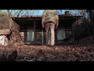
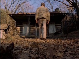
In the past I wrote an article about film, video formats and how in order to follow fashions films had been damaged by the pan and scan axe or worse in the 16:9 TV transition had been massacred again to “optimize” them to the new format, a terrible example being SamRaimi’s cult Evil Dead, The House, which was remastered from the original 16mm 3:2 into a forced 16:9 massacring it with brutal cutting above and below of the images.
unfortunately, not only were the 1990s and early 2000s the scene of the various kinds of savage cuts of shots without respecting the original framing in any way, but often damaging the narrative structure of the film, in Evil Dead key elements in the story are hidden by these cuts.
Jack Cardiff (1914-2009) was a Director of Photography who worked on almost 100 films, a lifetime achievement Oscar as DoP, several Oscar nominations and many other awards both nominated and won, so a technician and an artist of his work, who made thoughtful decisions and above all deserves respect for his work.
Why do I mention this author? Because I just bought the bluray of a film dear to me from childhood, The Eye of the Cat 1985 , a trilogy of stories written by Stephen King, Sometimes They Come Back, which have as their common denominator an alley cat.
It is a pity that in the current release one of these so-called remasters was performed…. if it had been a curated restoration with the supervision and approval of the director of photography, I could also understand, but unfortunately here we are talking about a massacre in the name of fashionable (modern) trends in color correction and image manipulation.
The master is from a film from the 1980s, so with grain present, with a certain kind of light and contrast, with colors that are not over-saturated, and a photography job of a certain kind. Unfortunately, whoever did the remastering followed a series of quite questionable and especially very trivial choices on a well-defined photograph. I decided to compare two masters, that of the English edition, more faithful to the original film master, and that of the Italian bluray received.
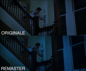
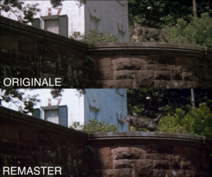 From the very first shots it is evident that minimal brightening has been applied to the film, a little dark, but the color has often been altered according to modern fashions and the Orange and teal trend. In this first image, it is evident how the shadows have been cooled, for no specific reason other than an inauspicious fashion…
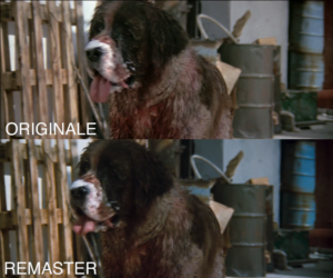 In this next shot, which quotes another Stephen King film, Cujo, we realize that for no reason in the remaster the anonymous bin on the right has been nicely highlighted with saturation…which distracts from the original composition and the dog’s snout…who knows if the colorist in question was aware of the basics of light, color composition applied by the Director of Photography?
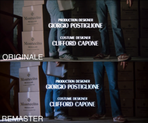
We are still in the opening credits, and after neutralizing the colors of the rear cartoons, the colors of the jeans have turned almost electric blue.
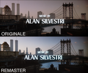 In this case, the rework is acceptable, except that the color was intentional, you can see the Tobacco-colored gradual ND filter gradient at the top…but to this colorist it probably looked too 80s (hey! it’s a film shot in the 80s).
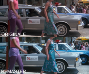 Another intervention on the blues, notice the greenish dress turning blue for no reason (and the other colors stayed more or less the same), but you have to give importance to that anonymous extra…surely the costume designer is happy that her choices are altered after 30 years…
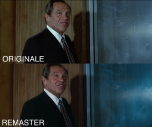 Again, for no reason we see this orange-less Teal on the door beside the actor. I wonder if the costume designer would have been pleased to know that the colorist wants to claim the right to change the set design.
And here we fall down … because if you do a remaster I expect to see a better, cleaner, more legible image, not that a night is made more saturated and darker than the original … this is not a night effect 🙁
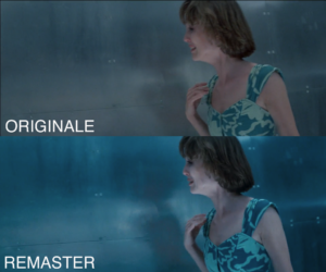 Let’s introduce more problems, let’s put a strong saturation behind the actress by bringing the dress the same color as the background, so it blends in better, or we lose the effect let’s stack the image well if not you can see that the cinematographer knew how to work…
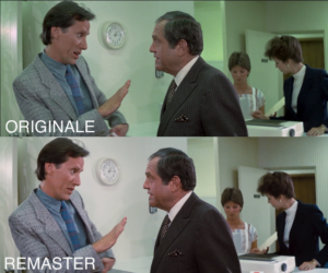 This time it’s curious how he decided to remove the green dominance of the walls, without touching the rest… maybe he thought they were a mistake introduced by the cheap LED lighting… ah no, they weren’t around in the 1980s, they used Tungsten lamps….
If he had seen the film a couple of times he would have noticed that green is used in the cinematography on a symbolic level and appears several times at certain times in the film.
A technique also used by Dean Cudney in Carpenter’s classic “The Thing” by anticipating with the color of light the arrival of one of the characters possessed by the alien.
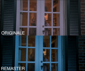 Another shot like, if it’s not blue, it can’t be a night shot, necessarily….
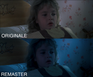
Here Drew Barrymore was too visible, so since it’s supposed to be night, let’s take everything to blue, darken, flatten the shot and make it less readable…
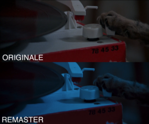 Let’s go replicate the look of Underworld, it’s horror anyway, they’re all the same, right ? the fact that you lose the hand of the evil gnome in the middle of the dark because there’s no more contrast with the red…
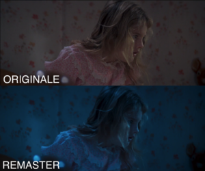 or that sweet Drew becomes a kind of pale vampire in her little room is just a detail, who pays attention?
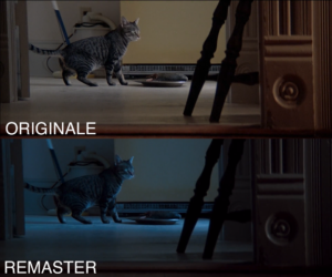 The scene is lit, but we make it blue, so it looks more nocturnal to gloomy, the fact that there are highlights, reflected light etc and directional shadows no one notices them…
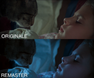 Here then the best of, a close-up on which we not only flatten the figure of the cat but make little Drew a vampire… yeah because the complexion if it were hit by blue light would not reflect the blue color like that, but the blood reflects the light… that kind of rendering depicted here is given by corpses or the living dead.
Now I understand that those who are ignorant of these matters might feel that I am taking it too hard for a few changes, but the serious thing is that one person has damaged the work of several teams of professionals in one fell swoop, changing the choices of the dop, the editor (because brightness and color are elements to be considered in editing), set and costume designers. I find it embarrassing that in order to follow fashions of some kind you turn the work of several people into an almost digital detour of a FILM, because to top it all off, there is also a certain level of pop in the images, that beautiful invention that turns even Barry Lyndon into the worst digital image from a low-level handycam.

